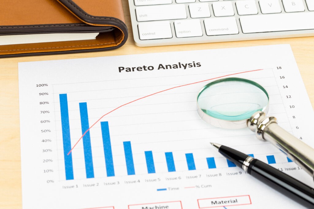
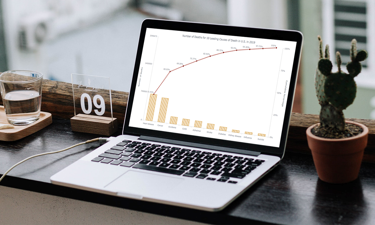
A Pareto chart is a graphical tool used to display the relative proportions of occurrence of different values. It is named after Vilfredo Pareto, an Italian economist who developed the concept. Pareto charts are useful for identifying the most important factors in a given situation. They can be used to prioritize actions and allocate resources. Keep reading to learn more about Pareto charts and how they can be used.
What is a Pareto chart?

A Pareto chart is a graphical tool used to display the relative proportions of occurrence of different values. It is named after Vilfredo Pareto, an Italian economist who first described the principle in 1906. The chart consists of a series of vertical bars, each representing a value and a line connecting the bars that represent adjacent values. The height of each bar corresponds to the proportion of occurrences of its value.
The Pareto principle states that, for many events, approximately 80 percent of the effects come from 20 percent of the causes. This principle can be applied to any situation where there are multiple causes or results. A Pareto chart can be used to identify which values are most important and what corrective action should be taken to address them.
A Pareto chart is a powerful data visualization tool for displaying and analyzing data. It can be used to identify the relative proportions of occurrence of different values and to highlight the most important values. It can also be used to identify potential causes of problems or to identify the most important factors in a process.
How can you read a Pareto chart?
A Pareto chart can be used to help you identify the most important factors affecting a process. The chart can be used to prioritize potential improvements to the process. The most important factor will be the one with the highest column on the chart. To interpret a Pareto chart, first, identify the most important factor affecting the process. Then, look for the biggest contributor to that factor. The biggest contributor is the most important opportunity for improvement.
To read a Pareto chart, find the category that you are interested in on the x-axis, and then find the corresponding number on the y-axis. The percentage shown is the percentage of items in that category that are in the given category.
How can Pareto charts be used?

There are many different ways businesses can use Pareto charts. One way is to use it to track and analyze inventory. Another way is to use it to track customer complaints. Businesses can use Pareto charts to track inventory by creating a chart that lists the different types of inventory and then ordering the inventory from most to least common. This will help businesses to identify which types of inventory are most common and need to be ordered more often.
Businesses can also use Pareto charts to track customer complaints. This can be done by creating a chart that lists the different types of complaints and then ordering the complaints from most to least common. This will help businesses to identify which types of complaints are most common and need to be addressed.
What are the benefits of Pareto charts?
When you’re trying to make sense of complex data, a Pareto chart can be an extremely useful tool. Pareto charts are designed to help you identify and isolate the most important factors in a given situation. In business, this can be used to help you focus on the most important tasks or to identify the areas where you can make the biggest impact. But Pareto charts are not just limited to business contexts as they can be used in any situation where you need to make sense of complex data. In fact, there are many benefits of Pareto charts that can be applied in a wide range of situations.
Pareto charts are easy to understand and use. Additionally, they can help you quickly identify the most important factors in a situation. These charts can also be used to prioritize tasks or areas for improvement. Finally, they are versatile and can be applied in a wide range of situations.
A Pareto chart is a valuable tool for data analysis that can be used to identify and prioritize opportunities for improvement. Overall, Pareto charts can be used to help identify and prioritize opportunities for improvement that will have the biggest impact on the organization.

